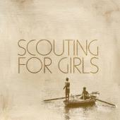
Throughout both of the promotional products a textured pattern has been used, as it is on both of them it creates continuity between the two products. This textured pattern creates an impression of it being old. This could be to make it seem that the band are reflecting over their childhood which is reinforced from the photographs of them inside the digipak from their childhood. The reflection of childhood is once again reinforced from the front cover of the digipak and the poster where there is a single image of two young boys playing in a boat.
The digipak and poster advertising the debut album by Scouting For Girls are constructed in a way which makes it easy to relate to their target audience. Ways they have done this is because in their digipak there are photographs throughout. These photos are of the band when they are younger, this would make the viewers of the digipak feel closer to the band. There are a few photographs on every page of the digipak, the visuals are in different locations on the page which keeps the viewer of the digipak interested. On the poster there is one image which is of two boys in a boat rowing – this is the same picture which is on the front cover of the digipak, this makes a relationship across the different mediums making it easy for the audience/fans of the band link the two products together.
The text in these two different promotional items show continuity. This is because they both have the same font and the same background colour. This wording is in the same font and colour as the bands name and the writing in the digipak. On both the digipak and the poster the font colour does not stand out a lot giving the impression that they are a band which sing slow songs however they really are a pop/folk band which is not expected from the colouring. On the poster the band’s name is in capitals and they are in large letters which takes up about a quarter of the page. The other wording on the page shows some of their key songs, the release date and their website. This information is important for the bands audience because it shows where and when they can purchase the new album from.
 The lyrics in the digipak are written in a way which creates a shape which relates to the song. An example of this is from the song ‘heartbeat’ which in the shape of a heart. Another, example is from ‘The aeroplane song’ which is in the shape of a paper aeroplane. I think this is an idea which I would be able to use in my digipak to promote the song Forty Steps To Rhona by Uncle Shaker. I could position the lyrics in the shape of some stairs or maybe the same of the number 40. These are just two ideas but I believe that doing this sort of thing would make it interesting.
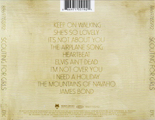
The digipak and poster both gives a lot of content about the band. The content from the poster is the bands name, the release date and 2 of the songs which are featured on the album. On the particular poster on previous page there is also a quote from different organisations for example The Guardian said ‘Every song is an anthem’. The digipak gives a lot of content about the band, for example its gives all the lyrics of the songs on the album, it gives a lot of bouns material such as the photographs from when they were younger. The back cover of the digipak gives a lot of content because it states what everyone in the band does/plays, there is also the track listing of the songs from the album.
From the two types of promotional products there is a lot of content about the bands given. The digipak gave the track listing on the back page, it also states what everyone in the band plays/sings. The photographs of the band from when they were little and the random drawings are bonus details which gives a better insight into the band and their fans would like this. The poster also shows some important content about the band – this being the release date of the album, some popular singles which are featured on the album and the website where the fans can find out further information. Both the digipak and the poster does not show quotations or reviews.


