Above is the music video which we created for our stop motion animation for the song 40 Steps to Rhona by Uncle Shaker.
Sunday 15 April 2012
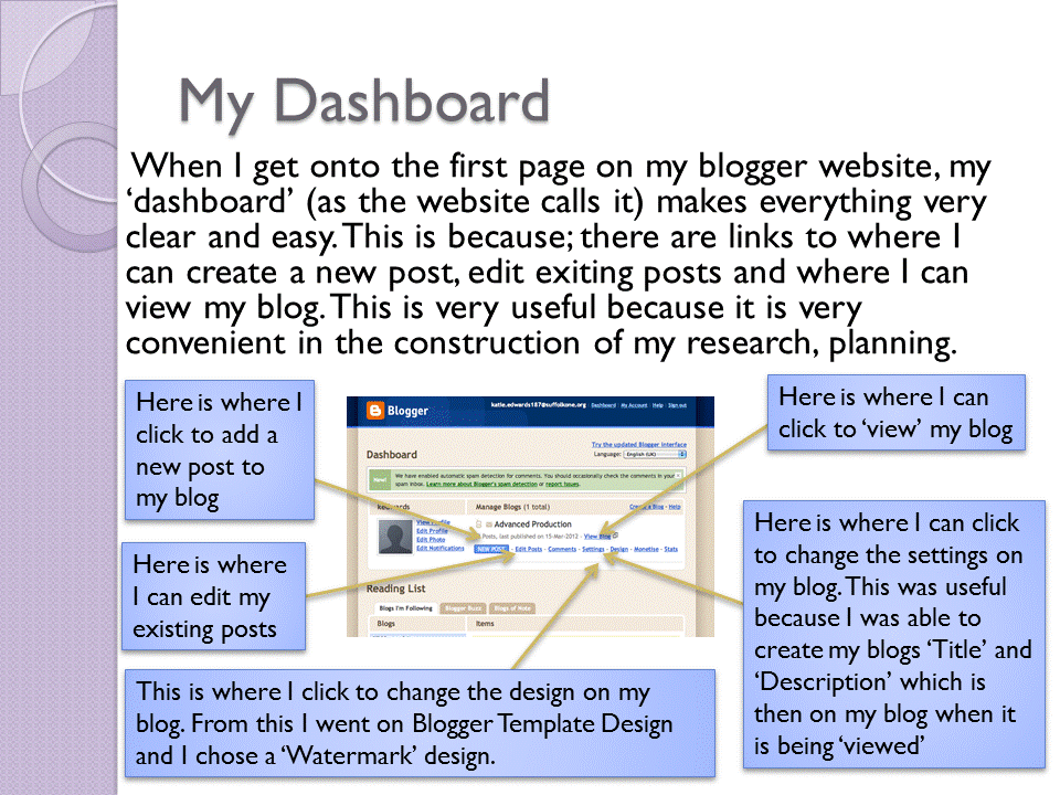
Media Evaluation - How did you use media technologies in the construction and research, planning and evaluation stages?
To answer question 4 of the evaluation i decided to make it into a power point. I was not able to add a link to my powerpoint and instead i had to convert each slide into a GIF GraphicsInterchange Format. Below are the slides for my powerpoint.


Thursday 15 March 2012
Media Evaluation - What have you learned from your audience feedback?
To answer question 3 of the evaluation i decided to make it into a power point. I was not able to add a link to my powerpoint and instead i had to convert each slide into a GIF GraphicsInterchange Format. Below are the slides for my powerpoint.


Media Evaluation - How effective is the combination of your media product and ancillary texts?
To answer this qestion I created an online powerpoint on the website Prezi. The website link is:
http://prezi.com/qhjcb3emhhug/edit/#12_1855138
To get onto the website my details are:
Email is: katie.edwards187@suffolkone.org
Password: evaluation
To make this website work you have to click the button in the bottom right corner (where it has a play button and it says 'show'). Then to move through each page press the same button again until it goes through all of the slides and then ends on the conclusion slide (after this press escape).

Encase this website does not work, i have copied the text from the website below.
I have tried to create effectiveness in the combination of
my main product (music video) and my ancillary texts (poster and digipak). I
have created this by using stylistic and thematic themes throughout my work. It
was also created through the moods, atmosphere and the meaning which I was
creating between the different products.
Some of the stylistic and thematic links which I created
between my main product and ancillary texts were effective in creating
continuity and similarities between the different products. The first thematic
and stylistic links I made was between the ancillary texts. This being because
I used the same writing throughout the digipak and on the poster. Another link
which I created between the ancillary texts was the style of the poster and the
digipak. This created a link between the two because I used my front cover of
my digipak and my poster. I created a thematic and stylistic link throughout
the digipak because most of the pages in my digipak are similar because there
is always a gramophone with lyrics and drawings coming out of it.
I created effectiveness throughout my main product (my music
video) and my ancillary texts (poster and digipak). This was created because I
always had an artistic style. This is shown from my music video being a stop
motion with photographs which I had taken and then cut out and placed on
different backgrounds to create my stop motion animation. This is showed in the
screen shot opposite. This artistic style is carried on throughout my digipak
and poster. This being because in the digipak we have hand drawn pictures
(which relate to the song), also the lyrics in the digipak are also going to be
hand written.
We tried to create a upbeat mood and atmosphere from our
audience. The happy atmosphere was created from using emotional pleasures for
the viewer. This was created through the use of our love story and from how the
couple stayed together. The story of a love story usually makes a happy
atmosphere so we decided to go along with this idea as the happy atmosphere
would work best with our stop motion animation video. This atmosphere was also
created because I used a hybrid of genres (two or more different genres) of
positivity and romance. These genres being animation and romance. The way how
these two were interweaved made a very happy atmosphere for the audience
viewing the music video. I believe that this atmosphere was succeed well.
I believe that the combination of my main product (music
video) and my ancillary products (advert and poster) were successful and worked
well in the fact that they all showed continuity between the different
products.
Media Evaluation - In what ways does your media products use, develop or challenge forms and conventions of real media products.
For this question I decided to write subtitles onto my music video. This is shown in the youtube video below.
http://www.youtube.com/watch?v=dzR294YJKeI&feature=youtu.be
However, if that does not work I have also answered the question below.
I have analysed many different media products so I could find out usual media conventions and forms for music videos, posters and digipaks. From these I learnt many things for example form the music video ‘Her Morning Elegance’ I learnt ideas of how to create stop motion.
From the advert ‘VW think blue campaign (symphony)’ I learnt many different techniques. The main idea which I used from this advert was the hand coming on the screen and drawing and writing different ideas (a screen shot of this happening during the advert is shown to the left). From this I decided to have a hand writing the title of my song and the band’s name at the start of the music video.
There are many ways in which my music products develop forms and conventions of real media products. The first example of this happening comes from the fact that our video shows the love story of a couple. This is very common in many music videos for example ‘Love Story by Taylor Swift’.
The song ‘Breakeven by The Script’ also shows the story of a couple however this is a negative portrayal whereas ours is positive. Following on from this example, the couple in the music video stay together throughout the entire video – there are a couple of occasions where the boy is on his own without the girl but through most of the video the boy and girl are together.
Another way, how my one of my media products develop forms and conventions is from the different pages of the digipak being similar. This is shown from the gramophone always being on the different pages – this creates continuity throughout the entire digipak. Each page of the digipak has lyrics of songs from the album by Uncle Shaker (the band from the song of our music video). This is a common convention of digipaks as many digipaks have the lyrics from their bands on them.
Furthermore, my media products develop forms and conventions from the front of our digipak being very similar to the poster. There are obvious links between the two of the different media products. This creates a sense of continuity between the different products. This is very common in promotional products for album releases for example Paramore’s album Riot which is shown to the right where the poster is above the album cover there are very clear similarities between these two promotional products. The same concept was also used in one of Paramore’s songs from this album Misery Business.
In addition to this another way how my media products develop conventions and forms of ‘real media’ products is from how my difgipak, poster and music video have artistic twist on them. This fits conventions because the genre of my band is folk/indie. This genre usually has artisitic twists on with their promotional products.
There are many ways in which my media products challenge expectations of forms and conventions. The first example of this is from my digipik not having any photographs of the band from the album. Which is usually common in digipaks. This is shown in the digipak front cover of Lady Gaga’s album (this is shown to the left). Lady Gaga has a very strong star image of being sexualised, however, another way how I challenged conventions is from not having a star image in my video, poster and/or digipak.
Final Poster

This is my final poster. This is linked with the digipak in many obvious ways. These being because it has the same background colour. Also the gramophone is the same as the front cover of the digipak. The poster has tour dates and locations on (which is common in album posters). There is also social networking symbols in the top right corner of the poster which is also common in posters. This has links with the music video because some of the writing on the poster has been hand written and in the music video the song title and the band's name are hand written also (in a similar font). This creates a clear link between the main product and the ancillary products.
Final Digipak
 |
| This is the front cover of my digipak |
 |
| This is the page in my digipak for the song Barcelona |
 |
| This is the page in my digipak for the song 40 Steps to Rhona |
 |
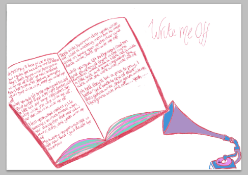
| This is the page in my digipak for the song Write Me Off |
 |
| This is the back page in my digipak |
Above are the pages for my digipak. I am happy with these pages because the gramophone are shown clearly on each page which creates continuity throughout. I also like the way how on the pages with the song lyrics the song titles are hand written in the way which looks like a signiture.
Creating a final digipak page
This explains the way how we created the pages for our digipak.
This page explains how we created the digipak page for the song '40 steps to rhona'.
Firstly we drew out by hand the main image, in this case it was of the stairs and of the gramophone. After this was drawn we by scanned this into the computer.
Secondly we changed the darkness of the images, making them darker.
Thirdly we edited the background to a light green colour.
 |
| This was the page of our digipak before we started to edit it using Photoshop |
 |
| This is our digipak page for' 40 Steps to Rhona' after we had editied it on Photoshop |
Creating the final poster
This is going to explain how we created our poster.
First we drew a gramophone on the right of a plain a4 piece of paper. After this we wrote Uncle Shaker on the bottom left of the page. After this we scanned this into the computer.

Then we changed the background colour of the piece of paper to a light blue. We chose this colour because it is light and pale which links with our music video which does not have any bold colours. Then we added on tour dates and the locations of the venues.

Then we added on 'Tickets on sale now'.

After this we added the social networking symbols for Twitter, Facebook and YouTube, in the top right hand corner of our poster.

Thursday 23 February 2012
Digipak Practice Page- Write me off Page
 |
| This is the picture after i scanned it into the computer |
 |
| This is the picture after i had added some purple to the gramophone |
 |
| This is the picture after i had added some green on the bottom of the pages of the book |
 |
| This is the picture after i had added blue to the gramophone. |
 |
| This is the picture after I had added pink to the record on the gramophone and on some of the pages of the book. |
 |
| This is a zoomed in screen shot of when I was writing Uncle Shaker onto the record. |
 |
| This is from after I added Uncle Shaker to the gramophone. Unfortunately it is not obvious that the name is on the record. |
 |
| This is my page for my digipak for the song Write Me Off |
Idea for a front cover for my digipak (with screen shots)
 |
| This is the picture which I started with before I began editing |
 |
| In this picture I have filled the buttons on the top of the 'boombox' purple, I have also written Uncle Shaker underneath the speaker sections. I did this so i could subtly place the bands name in the picture. |
 |
| In this picture I have added blue to the picture, i did this to add different colours to make it seem more interesting. |
 |
| In this picture i have added light blue/turquoise colour to section the other blue colour so it seemed more life artistic like the album covers of bands like Uncle Shaker. |
 |
| In this picture I have added more colours to the microphone to make it seem more interesting. |
 |
| In this picture I have added a microphone and I have started filling in it with different colours. |
 |
| In this picture i have written the name Uncle Shaker (on a website called DaFont), then i changed the colour to purple on PhotoShop (so it would work better with the rest of the front cover). I then moved the words so they would fit with the microphone wire- this being so it seemed continuous. Like it does in Bruno Mars's song Just the way you are (which is shown below) |
 |
| This is the screen shot of Bruno Mars's song which i was hoping to achieve. |
During all of the song 'Just the way you are' by Bruno Mars there is a lot of writings and drawings made out of the cassette tape (which is where I got the idea from) the music video is below
After this work on the front cover of my digipak, I have decided not to do this idea anymore because I believe that it does not fit well with my bands music and their genre. So i have decide to do something else for my digipak which would work better.
Subscribe to:
Posts (Atom)