- Walk diagonally across towards the wall, look up half way
- Continue walking towards the wall
- Stop at wall, pretend to be writing on the wall
- Walk away from the wall and off the screen
- Walk up to the stairs, sit down
- Look at each other and look around
- Run up the stairs and around the corner
- Show them running around the corner of the new steps and then up them
- Run down a set of stairs
- Walk across to the wall and pretend to write
- Stop and look at the pretend writing
- Walk away from the writing
- Walk across from left to right stop look up
- Shocked faces
- Jump back (as if startled)
- She blindfolds him (will have to go on tiptoes so she will be able to reach)
- Hold his hand and guide him out of the shot
- He still has on the blindfold – she guides him down stairs and for him to sit down
- Take off the blindfold, throw over the edge of the banister
- Sit looking at each other and looking around
- Stand up and walk of the stairs
- He walks down stairs
- She walks across
- Both run upstairs together, she falls over and he helps her up
- Get to the top of the stairs and then walk of right
- He walks across dancing
- Walk up to the stairs, sit down
- Look at each other and look around
Thursday, 29 December 2011
Action list for filming
Sunday, 18 December 2011
Setup for our stop motion music video
These photographs show the setup which we had for our stop motion. They show that we had a light set up facing the ceiling to bounce of the light to create the same light throughout our filming. One of these photographs shows the camera which we used to take the photographs for our stop motion. This camera was linked to the mac book by a USB cable.


Digipac research - Scouting For Girls: Everybody Wants To Be On TV


To the right is the CD from the album. The background of this is the blue from the front and back covers of the digipac. The letters are written in white (like on the digipac). These colours links all of the digiac together and the CD. I would like to be able to create my disk to be the same colour as my digipak however, i will not be able to do this as we do not have the correct equipment/software to make this happen.
Digipac and Poster research - Paramore: Riot
The album Riot by Paramore has a very clear image which relates to both the digipac and the album poster.

This is because the front cover of the digipac has the word riot repeated many times in different sizes in black. (The front cover of the digipac is shown opposite.) However the digipac then has riot written in capital letters in red with an exclamation point. This makes it stand out from the rest making it clear that 'Riot' is the main title.

To the left is the back cover of the digipac. The back cover is linked to the front cover because it shows riot being repeated many times in black letters. Then the track listing is written in red, making it obvious that it is the most important part on the back page.

To the right is the poster which represents the album. This poster has clear links with the digipac because it has the same backgrounnd as the front and back cover of the digipac (the black writing of riot). This poster has a photograph of the band which takes up about half of the poster.
I thought that the idea of having the main word repeated many times on the page was a good idea. This helped me decide that we should have this somewhere in our stop motion music video - for example where 'your lies' is repeatedly sang in the song.
Below are some songs by Paramore which gave me some inspiration for ideas what i could add into my music video:
This video gave me inspiration because on the wall it has the albm title written many time and i am going to have important words repeated in my music video.
This video gave me inspiration because during the corus there are many letters on top of each other and i thought this might be a good idea to do for my corus in my music video.
Thursday, 8 December 2011
Reasons why I researched photographs of guitars and missiles
I researched these photographs because they relate to the songs which will be on the album. The missiles will relate to the song 'missiles of love', and the guitar will relate to the folk genre of the music. I am also going to have pictures of love hearts and friends leaning on the guitar (which will relate to the 'lean on your friends' song on the album).
My idea for the poster/cover is to have a guitar in the middle with stairs along the neck, on either side of the guitar there are going to be people holding it up to make it seem as if the guitar could lean on them. Missiles are going to be on the page (shooting out love hearts) .
My idea for the poster/cover is to have a guitar in the middle with stairs along the neck, on either side of the guitar there are going to be people holding it up to make it seem as if the guitar could lean on them. Missiles are going to be on the page (shooting out love hearts) .
Photographs of cartoon missiles for research for my poster and digipac


I researched these because they related to one of the songs by Uncle Shaker 'Missiles of Love' however i have decided not to use this idea because it will not create good final product. I believe that i would be able to create a better final outcome if i did not use this idea.
Photographs of guitars for research for my poster and digipac


I have found all of these photographs of guitars because i was thinking about using them on my digipak however, i have decided that i do not want to use this idea anymore. This is because i believe that if i used these photographs the final outcome would not be as good if i would have done a different idea for my ancillary products.
Photographs for my stop motion animation


The photographs above are from one of my scenes of my stop motion animation. These different photographs show the process which had to be taken to get our final result. These photos shows that we had to get the couple to walk slowly across the location so we were able to take photographs with a high shutter speed. After getting these photographs we had to print them off and then cut them out, in order to place them on the different location backgrounds to create our stop motion animation.
What I learnt from my practice stop motion
From my practice stop motion animation, I learnt what I needed to change for my final stop motion animation music video.
These included:
- I needed to plan out each individual photograph before trying to take them.
- I needed to keep going onto the correct camera settings to take the photographs (because it changed after ever twenty photographs).
- I learnt that choosing the correct location was important because otherwise a lot of people walk in front of the photographs, or the tripod had to be moved to let people walk through the doors (which we were near).
- I learnt that it is important to try to keep the tripod level because otherwise the photographs were not straight.
Practice for our stop motion


The photographs above are from my practice shoot for my stop motion animation. This shows how we had to take 12 photographs per second, this was so we could take the photographs, so then we could cut them out and move them on the background. This practice was needed in order to make sure that we were prepared for when we were taking the photographs for the real advanced production.
Friday, 11 November 2011
Research task 3 - Content analysis of Digipak and poster – Scouting For Girls debut album
The debut album of Scouting For Girls relates to the band Uncle Shaker (the band of my music video song) because some of the songs by Scouting For Girls have the same tone as Uncle Shaker. Some of the songs by Scouting For Girls have a similar message as those of Uncle Shaker’s for example both bands have music which are love songs which relate to either the formation of relationships or the breakdowns of relationships. For this reason I decided to analyse Scouting For Girls debut album digipk and poster because I believe I could use some of their ideas in my own digipak and poster to advertise the song Forty Steps to Rhona by Uncle Shaker.

 The lyrics in the digipak are written in a way which creates a shape which relates to the song. An example of this is from the song ‘heartbeat’ which in the shape of a heart. Another, example is from ‘The aeroplane song’ which is in the shape of a paper aeroplane. I think this is an idea which I would be able to use in my digipak to promote the song Forty Steps To Rhona by Uncle Shaker. I could position the lyrics in the shape of some stairs or maybe the same of the number 40. These are just two ideas but I believe that doing this sort of thing would make it interesting.
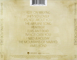
The digipak and poster both gives a lot of content about the band. The content from the poster is the bands name, the release date and 2 of the songs which are featured on the album. On the particular poster on previous page there is also a quote from different organisations for example The Guardian said ‘Every song is an anthem’. The digipak gives a lot of content about the band, for example its gives all the lyrics of the songs on the album, it gives a lot of bouns material such as the photographs from when they were younger. The back cover of the digipak gives a lot of content because it states what everyone in the band does/plays, there is also the track listing of the songs from the album.

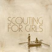
Throughout both of the promotional products a textured pattern has been used, as it is on both of them it creates continuity between the two products. This textured pattern creates an impression of it being old. This could be to make it seem that the band are reflecting over their childhood which is reinforced from the photographs of them inside the digipak from their childhood. The reflection of childhood is once again reinforced from the front cover of the digipak and the poster where there is a single image of two young boys playing in a boat.

The digipak and poster advertising the debut album by Scouting For Girls are constructed in a way which makes it easy to relate to their target audience. Ways they have done this is because in their digipak there are photographs throughout. These photos are of the band when they are younger, this would make the viewers of the digipak feel closer to the band. There are a few photographs on every page of the digipak, the visuals are in different locations on the page which keeps the viewer of the digipak interested. On the poster there is one image which is of two boys in a boat rowing – this is the same picture which is on the front cover of the digipak, this makes a relationship across the different mediums making it easy for the audience/fans of the band link the two products together.
The text in these two different promotional items show continuity. This is because they both have the same font and the same background colour. This wording is in the same font and colour as the bands name and the writing in the digipak. On both the digipak and the poster the font colour does not stand out a lot giving the impression that they are a band which sing slow songs however they really are a pop/folk band which is not expected from the colouring. On the poster the band’s name is in capitals and they are in large letters which takes up about a quarter of the page. The other wording on the page shows some of their key songs, the release date and their website. This information is important for the bands audience because it shows where and when they can purchase the new album from.
 The lyrics in the digipak are written in a way which creates a shape which relates to the song. An example of this is from the song ‘heartbeat’ which in the shape of a heart. Another, example is from ‘The aeroplane song’ which is in the shape of a paper aeroplane. I think this is an idea which I would be able to use in my digipak to promote the song Forty Steps To Rhona by Uncle Shaker. I could position the lyrics in the shape of some stairs or maybe the same of the number 40. These are just two ideas but I believe that doing this sort of thing would make it interesting.
The digipak and poster both gives a lot of content about the band. The content from the poster is the bands name, the release date and 2 of the songs which are featured on the album. On the particular poster on previous page there is also a quote from different organisations for example The Guardian said ‘Every song is an anthem’. The digipak gives a lot of content about the band, for example its gives all the lyrics of the songs on the album, it gives a lot of bouns material such as the photographs from when they were younger. The back cover of the digipak gives a lot of content because it states what everyone in the band does/plays, there is also the track listing of the songs from the album.
From the two types of promotional products there is a lot of content about the bands given. The digipak gave the track listing on the back page, it also states what everyone in the band plays/sings. The photographs of the band from when they were little and the random drawings are bonus details which gives a better insight into the band and their fans would like this. The poster also shows some important content about the band – this being the release date of the album, some popular singles which are featured on the album and the website where the fans can find out further information. Both the digipak and the poster does not show quotations or reviews.
Audience feedback after Pitch
To gather audience feedback we pitched our idea to 25 people who fall into our target audience of 15-25 year old. From this information we were able to change some of our ideas to fit what the target audience thought would be best.
From these questionnaires we found out that 24/25 people thought that our idea seemed entertaining. The main reason they said that the idea seemed entertaining was because there is not a lot of other music videos which has the same idea as us, this made them think that it would be refreshing and new. The target audience also thought that it would fit to our genre conventions of folk/indie.
All of the people from our pitch thought that it would fit our target audience (15-25 years old).
When asked if us showing the different seasons was a good idea 23/25 of the audience believed that it was a good idea. This mainly being because they thought that it would make the couple seem as if they have been together for a long time creating a strong connection between the two.
24/25 of our pitched people believed that the stop motion would fit our music. They believed that our folk/indie song was the perfect sort of song to fit a stop motion video.
All of our audience believed that the videos which we used for inspiration, were useful in providing them with an idea of what we were trying to achieve with our personal video.
When asked if they thought the drawing and writing of important words on the page was a good idea 23/25 of them believed it was a good idea as it would create a link between the visuals of the video and lyrics of the song.
When asked what is the most entertaining part of our video, the majority answered by saying: the drawing and writing of important words from the song was the most entertaining section. This is because; it would create a strong link between visuals and lyrics - which are needed in this sort of video.
When the target audience was asked how could we improve our video a lot of answers were ‘’you can’t”. However this is not very helpful, so we looked for the ‘real answers’, and then the most common answer was that: they were unsure if we should show the hand while the important words and drawings were being drawn onto the paper.
From our feedback we were able to decide to only show the hand while writing the title, then not to show the hand anymore. We came to this decision because it was clear that the idea of showing the hand was unpopular, this made us feel that we should not use it throughout and only use while writing the title – this was to make the title stand out and show that it is important.
Completed questionnaire for audience feedback from pitch

Above is a completed questionnaire which one of our target audience filled out after they listened to our pitch. After gathering all of our completed questionnaires we compared them to find the most common answers and then used these to change/improve our ideas.
Questionnaire for audience feedback after pitch
1. Does our idea seem entertaining and why?
Yes No Why ________________________________________
2. Do you think our target audience of 15-25 years is appropriate?
Yes No
3. Is our idea of showing different seasons a good idea and why?
Yes No Why _________________________________________
4. Do you think our stop motion idea will fit with the music?
Yes No
5. Do you think the videos we used for inspiration are good?
Yes No
6. Do you think drawing/writing important words on the page is a good idea?
Yes No
7. What is the most entertaining part of our video?
______________________________________________________________
8. How can we improve our video?
______________________________________________________________
Thursday, 10 November 2011
Research task 2 - Star image - Lady Gaga
In 1985, Richard Dyer’s stated that ‘stardom is constructed from a range of materials’. This shows that stars are created through the use of many different mediums and not just one. This is shown with Lady Gaga this is because she would not have become a star without all of the mediums. These different mediums include her music videos, her website and her Cd covers. Her star image is also created by her live performances and all of her media coverage.
During Lady Gaga’s music videos there is a lot of voyeurism (an example of this is from her the video below) this is created through the mise-en-scene. The costumes which she wears will make males ‘gaze’ at her in a sexualised manner (this relates to the Freud’s theory). Some females will ‘gaze’ at her in admiration and wish to be her. Mulvey says that cinema is gendered in a way which women are on display and they are sexualised through the act of looking – this theory is shown in most if not all of Lady Gaga’s music videos.
The mise-en-scene which is used in Lady Gaga’s music videos creates a rich atmosphere (this rich atmosphere is shown in her music video pokerface - below) . The locations which are used create this rich atmosphere this could be to create a star image for her of being rich. This could be so people look up to her and wish to be her.
During Lady Gaga’s music videos she often uses narrative and performance. Her music videos cut between both narrative and performance this could be so her passion for music is shown but also it shows the fun side of her which creates a major part of her star image.
 Her music videos show a relationship between the lyrics and the visuals on screen. This will be to reinforce the message which is being conveyed, both the lyrics and the visuals will create her individual star image.
 During her music videos there are many close-ups of Lady Gaga this will be to create her star image. These close ups are there to create a relationship between the audiences of the video and Lady Gaga. These close ups allows the audiences to create a direct address and close observations of her facial expressions, body language and gestures. All of these create her individual star image. The close ups which show her face, parts of her face are usually covered in these close ups this could be to cover up some of her identity and also to create part of her star image. This star image is also used on her album covers because she is usually wearing a lot of eye makeup or wearing sunglasses or masks.
During her music videos her non-verbal communications and her body language are very sexualised and suggestive. However these actions are also linked to her lyrics which creates a strong relationship between the visuals of the video and the lyrics which are being sung.
 On all of Lady Gaga’s album covers she uses the same font, this could be to create continuity between the different albums also this creates part of her star image. This font is also used on her website which creates a cross media star image. Throughout both her album covers and her website most of the words are written in white or red. This is quite contrasting to the black/dark backgrounds; this dark background could be to represent her darker personality.
On her album covers there are photographs of her which express her individual star image. This image is different to the conventional ones of pop artists this is because it is more dark and twisted to what you expect of the pop genre. A lot of the photographs are in black and white however her lipstick is bright red this could be to represent lust, passion, sex which is key parts of her star image.
In the background of Lady Gaga’s website there is a big picture of her this could be to reinforce her star image and so people can see her personality clearly as soon as they enter the site, and while they are searching on the site (as the picture is on every page).
In an interview with about.com Lady Gaga was asked ‘Whats the story behind the song ‘Paparazzi’, because there’s been a few interpretations of it?’ Her response to this question was ‘Well I'm so glad there are a few different interpretations, that was the idea. The song is about a few different things – it's about my struggles, do I want fame or do I want love? It's also about wooing the paparazzi to fall in love with me. It's about the media whoring, if you will, watching ersatzes make fools of themselves to their station. It's a love song for the cameras, but it's also a love song about fame or love – can you have both, or can you only have one?’
In her video ‘paparazzi’ (shown above) these idea of her are portrayed well and it is obvious to be able to create a relationship between her initial ideas and the visuals and lyrics from the music video. In this interview her star image is also created this being from her wanting the ‘paparazzi to fall in love’ with her. This is shown throughout her star image because she always tries to get the paparazzi fall in love with her - this being from her close ups with the camera during her music videos, the fact that on her cd covers there are mainly close ups.
In her video ‘paparazzi’ (shown above) these idea of her are portrayed well and it is obvious to be able to create a relationship between her initial ideas and the visuals and lyrics from the music video. In this interview her star image is also created this being from her wanting the ‘paparazzi to fall in love’ with her. This is shown throughout her star image because she always tries to get the paparazzi fall in love with her - this being from her close ups with the camera during her music videos, the fact that on her cd covers there are mainly close ups.
Throughout many different mediums Lady Gaga has created a very individual star image. This star image is shown during her; music videos, album covers, lyrics, website, live performances and all of her media coverage. She also carries this star image while she is giving interviews and is in the public eye. The fact that this star image is always with her makes people create a link between the different mediums making it easy for people to recognise her in different circumstances. Lady Gaga’s star image is very individual and unique and does not conform to the genre characteristics of pop music.
Tuesday, 8 November 2011
Example of stairs - location shots
Below are some of the photographs which we are going to use as backgrounds for our stop motion animation.

This photograph is going to be used for the house scenes, such as: his birthday and christmas.

To the right is one of the photographs which we are going to use for our Valentines Day scenes. We are going to make this look like Valentines Day by the use of props for example love hearts.

To the left is one of the photographs which we are going to use during the guitar solo.

To the right is the photograph which we are going to use for our Halloween section. We are going to have drawn ghosts on the walls to make it seem scary. We are going to use this during the guitar solo.

This is the final background for our stop motion animation, we are going to use this to represent new years.
Above are a few of the photographs which we are using as backgrounds for our stop motion animation. We have decided to use these because they show different seasons of the year. This is needed with our idea because we are going to show a year of the couples life together (which needs to be shown by different backgrounds).
Forty Steps to Rhona annotated lyrics for stop motion music video

Above shows the lyrics to the song which we are creating a stop motion animation music video for. I have annotated these lyrics because with our video we are able to to clearly create a relationship between the lyrics and the visuals on the scene. The easiest way to do this was for us to annotate the lyrics and then use this annotation as the basis for our storyboard. We did not follow all of the ideas which we had on the annotations above, however it was more useful to have the foundation for our storyboard.
Subscribe to:
Posts (Atom)